Gray Rental Walls You Can’t Paint? Build the Palette Around What You Actually Like
What colors go with gray walls? Use undertone, lighting, contrast, and the furniture you already love to build a rental room that doesn’t feel dominated by gray.
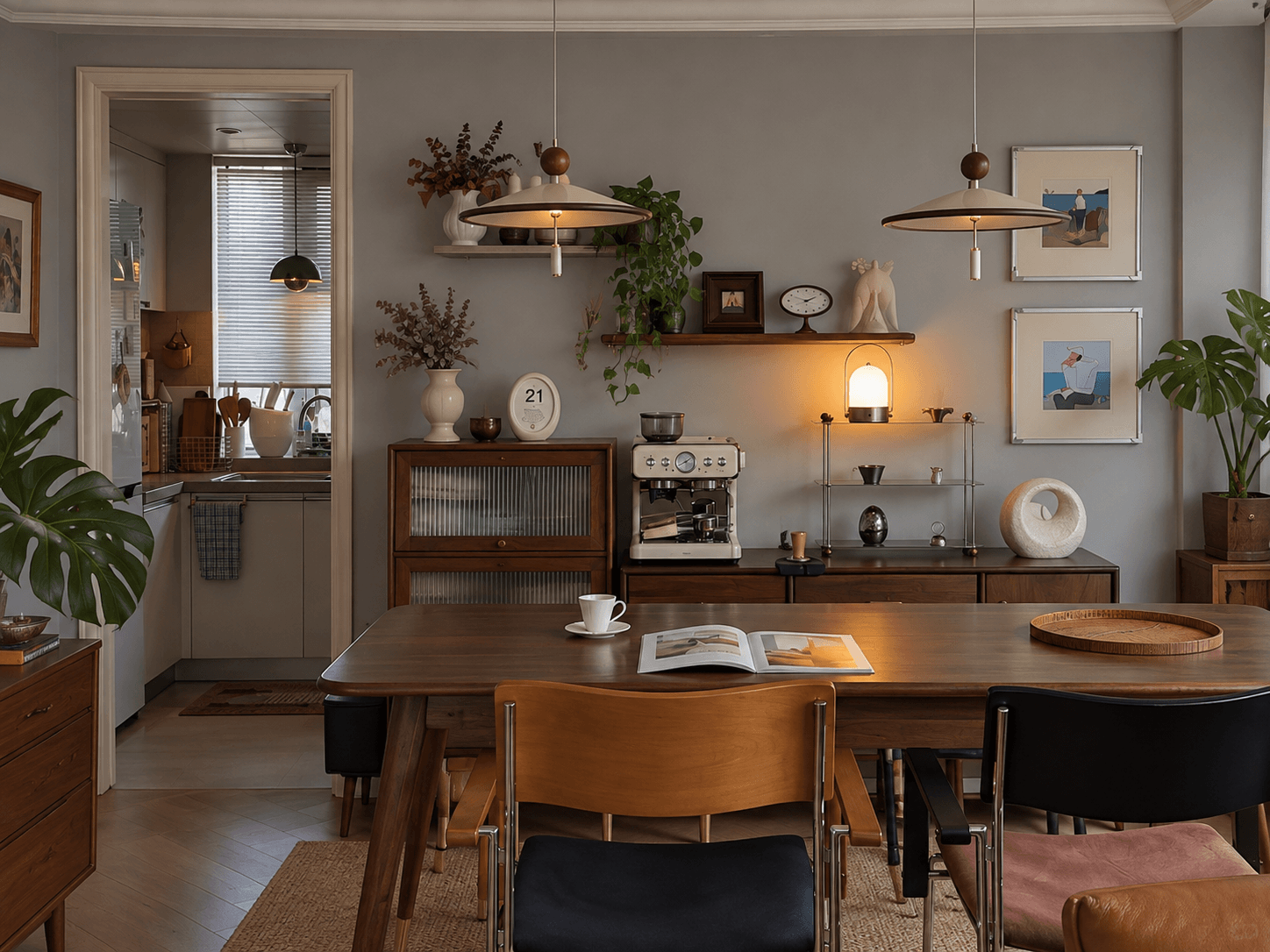
Gray walls can work with cream, warm wood, rust and terracotta, olive or sage, blush, navy, black, and plenty of other colors. The better choice depends on the gray’s undertone, the light in the room, and how much contrast you want.
But in a rental, you do not have to build the entire palette around a wall color you never chose.
Start with one movable thing you actually like—a rug, sofa, art, curtains, or bedding—and let that lead the room. The gray only needs to work in the background.
Quick Take
What Colors Go With Gray Walls? Start With What You Want the Color to Do
| IF YOU WANT THE ROOM TO… | TRY STARTING WITH… |
|---|---|
| Feel warmer | Cream, warm wood, rust, terracotta, blush |
| Feel softer and more natural | Olive, sage, oatmeal, wood tones |
| Have stronger contrast | Navy, black, deep green, saturated color |
| Feel less dominated by gray | Start with a rug, art, sofa, or textile you already like |
These are starting points, not compatibility rules. The same color can look different beside a blue-gray wall, a warm greige, or the same wall under different lighting.
First, Decide What You Actually Dislike About the Gray
“I hate these gray walls” can mean several different things.
Maybe the room feels cold, especially at certain times of day.
Maybe the paint keeps looking blue, purple, or slightly green next to the things you own.
Maybe the wall itself is tolerable, but the gray flooring, gray sofa, and gray curtains are making the whole room feel washed out.
Or maybe there is nothing technically wrong with the color.
You just would never have chosen it.
Those are different problems. Treating all of them as “gray walls need warming up” can send you shopping for fixes you do not need.
If the Room Feels Cold, Check the Light First
Before changing the palette, look at the same wall twice:
Once in daylight. Once under the lights you normally use at night.
Does a fairly quiet gray turn steely or blue in the evening? Does the whole room suddenly feel flatter once the lamps come on?
If the difference is obvious, start with the light.
That does not mean a warm bulb will magically turn cool gray into a warm neutral. It means you should not buy a room full of beige, rust, cream, and warm wood to compensate for a lighting problem you have not diagnosed.
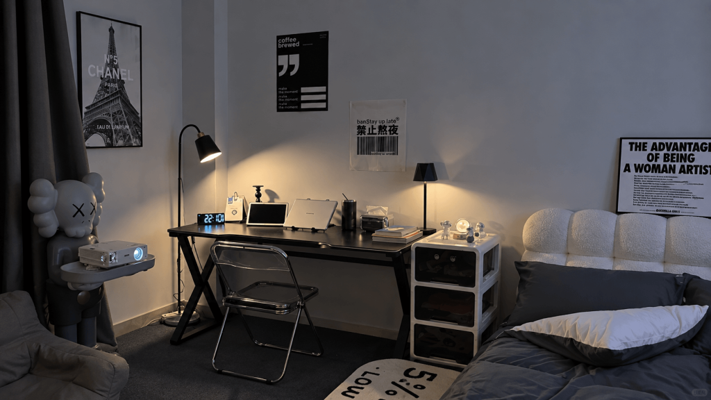
Do not make the whole room warmer to compensate for one bad bulb.
If the room itself is poorly lit—not just the wall—start with Dark Rental Apartment? Fix the Lighting Before You Fight the Room.
The goal is not to change the paint into another color. It is to see what the wall looks like once the room is lit in a way you actually want to live with.
If the Gray Looks Blue or Purple, Stop Treating It as “Just Gray”
What if the wall looks blue, purple, or green in daylight too?
Now the wall itself deserves more attention.
You do not need the paint name or a perfect diagnosis of its undertone. Look at it beside the things that are staying: the floor, sofa, wood furniture, curtains, bedding, or rug.
Notice which combinations make the unwanted color louder.
This is where generic advice to “add warm colors” can backfire. Contrast does not always neutralize an undertone. Sometimes it makes the color you dislike easier to see.
You do not need to correct the undertone. You need to stop accidentally emphasizing it.
That is enough. The wall does not have to become the neutral you wish the landlord had chosen.
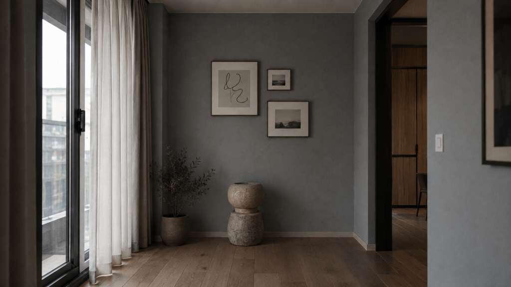
Stop Repeating the Gray and Build From Something You Chose
The gray wall already occupies a huge amount of visual space.
It does not need help.
A gray sofa, gray rug, gray curtains, silver finishes, and mostly black-and-white decor may all coordinate beautifully with the wall. They also give the gray more of the room.
The wall came with the rental. Your whole palette doesn’t have to.
Once you know the basic color options, do not let “what goes with gray” become the only rule for the room. Start with something you actually want to live with.
Maybe it is a rug you love. A piece of art. Your sofa. Patterned bedding. Curtains. A wood dresser you would take to your next home.
Let that lead.
If your rug gives you rust, olive, cream, and blue, those colors can belong to the room because you chose the rug—not because they passed a compatibility test with the paint.
Choose one thing in the room that actually feels like you, and let that lead the palette instead of the wall.
The gray only needs to stay far enough in the background that it stops deciding everything else.
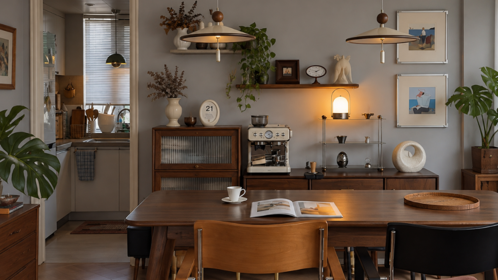
You Do Not Have to Make the Gray Look Warm
There is a difference between making a gray wall look warm and making a room feel warm.
A cool gray wall may stay cool even after the lighting improves and the rest of the room changes.
That is not necessarily a failure.
If the room now feels comfortable, colorful, cozy, or simply more like your style, the wall no longer needs to change character.
The room can feel warm even if the wall never does.
Your furniture, rugs, curtains, and art also have lives beyond this rental. They do not need to be chosen around a paint color you are leaving behind.
Know When to Stop Fighting the Wall
Eventually, the gray may still be visible, still be gray, and no longer be much of a problem.
The lighting feels better.
The room has a palette that did not come from the wall.
And when you walk in, your attention goes to the things you chose rather than the paint you did not.
That is enough.
You do not need to cover every wall or keep buying things to make the gray disappear.
A wall can stay gray without the room becoming a gray room.
Once that happens, leave it alone.
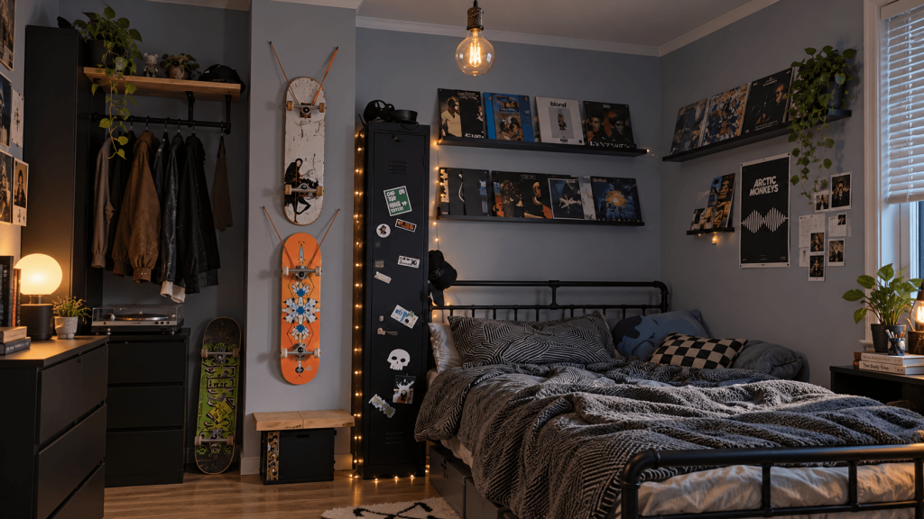
So, How Do You Live With Gray Rental Walls You Can’t Paint?
Start with what the gray is actually doing.
If the room mainly feels cold at night, check the lighting first.
If the wall stays blue, purple, or green across different lighting conditions, notice what around it makes that undertone louder.
If the whole room is turning gray, stop repeating the wall color.
And if gray simply is not your style, build the palette from something you chose instead.
The wall came with the rental.
The rest of the room is still yours.
FAQ
What colors go with gray walls?
Gray works with many colors, including cream, warm wood tones, rust, terracotta, olive, sage, blush, navy, and black. The better choice depends on the gray’s undertone, the room’s light, and whether you want the room to feel warmer, calmer, or more contrasting.
How do you make gray walls feel warmer without painting?
You do not have to build the entire palette around the gray. Start with something you actually like—a rug, artwork, sofa, bedding, curtains, or wood furniture—and let that guide the room. Then check whether the wall strongly conflicts with those choices rather than assuming everything needs to match it.
What color furniture goes with gray walls?
Do not choose furniture only because it matches the wall. Warm wood, cream, cognac, navy, green, and other colors can all work depending on the room. In a rental, prioritize furniture you would still want after you move rather than buying around the landlord’s gray paint.
How do you decorate a living room with gray walls?
Start with one movable anchor—a rug, sofa, artwork, curtains, or wood furniture—and build the palette from that rather than from the wall. Then use lighting and contrast to keep the gray from dominating the room.